Client Overview
Meet SDI Presence. They aren’t your cousin’s IT startup. They’re a $100M+ powerhouse with 475+ employees that provides turnkey IT services to massive enterprise clients and U.S. government agencies. Think managing tech for the California Highway Patrol or the Chicago Bears. They’re serious people doing serious work.
Their website, however, was not so serious. It was seriously outdated.
Challenges
SDI’s WordPress website was a relic from a bygone era, held together by ancient plugins and forgotten code. We’re talking:
- A Frankenstein Structure: Over 250 pages, many of them lost to time like digital Atlantises. The navigation was a labyrinth where users went to get lost.
- An Antique Design: The look and feel hadn’t been touched in about 8 years. Think colors and a design that screamed, “I was cool when the first Avengers movie came out.”
- Content Chaos: A library of 450+ CMS items (blog posts, news, case studies) was trapped in a database with inconsistent formatting and no clear structure.
- Plugin Roulette: Every time WordPress had a sitewide update, something on the website would inevitably break. It was a game of chance nobody wanted to play.
The brief was simple: take this digital dinosaur, drag it into 2026, and move it from a creaky WordPress mansion to a slick new Webflow penthouse. Simple, right?
The Solution:
It was a full-scale digital renovation. The project scope included:
- Full Redesign & Re-architecture: Develop a scalable system of 18 unique page layouts, which included one master template for all 9 service pages and another for the 8 industry pages.
- Custom Graphics & Motion Design: Create a unique visual identity for every single service and industry.
- Massive Content Migration: Rescue all 450+ CMS items (blogs, news, case studies) from the WordPress abyss.
- Complex Form Integrations: Tangle with ~15 unique, beastly HubSpot forms.
- Marketing Team Empowerment: Hand over the keys to the kingdom so their team could finally be self-sufficient.
The Design Saga:
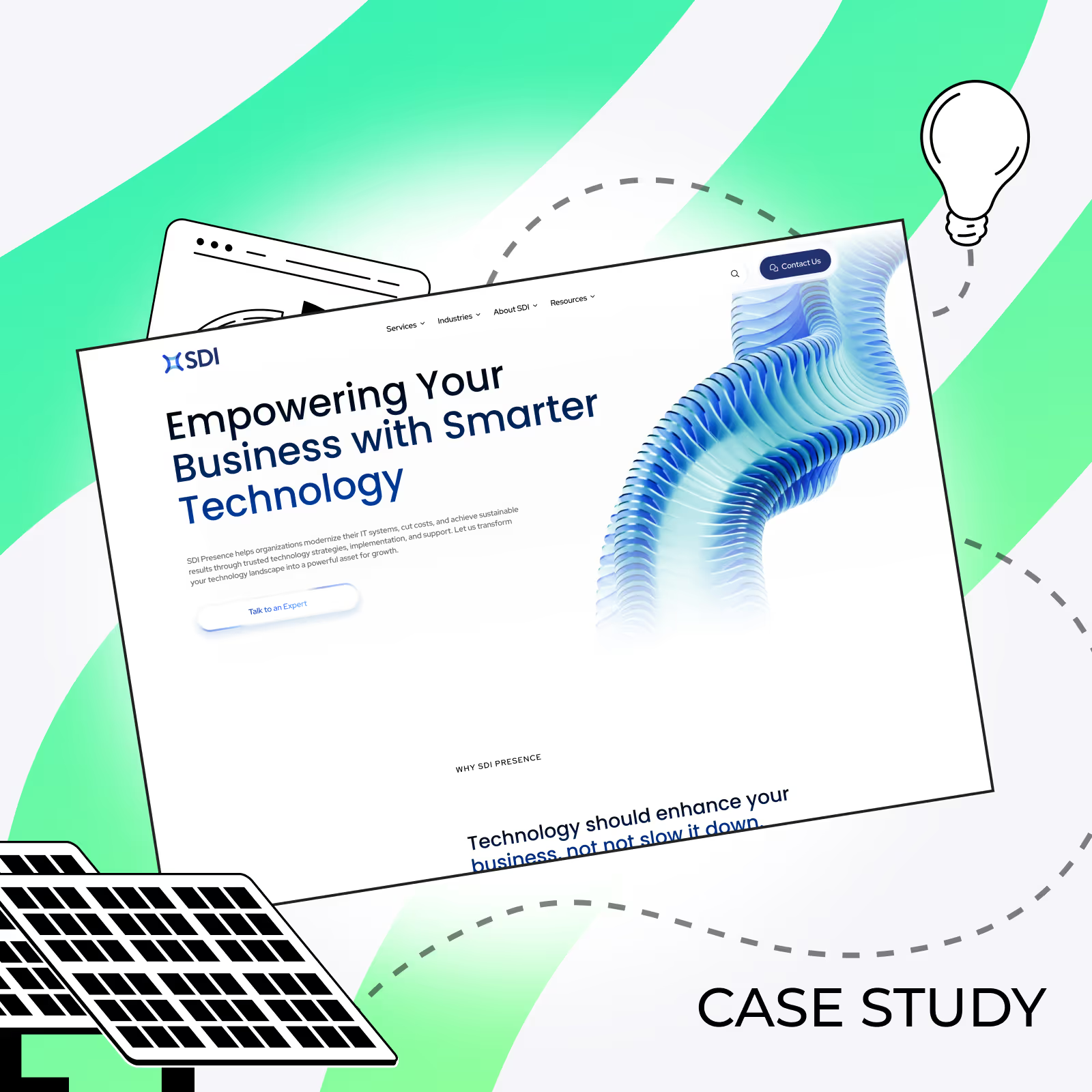
Before a single pixel was placed, we went full-on detective. We started with mood boards, presenting the client with four distinct visual “universes” for their new website. They chose a direction, and our first big move was to rescue their color palette, evolving it from a dated turquoise to a clean, authoritative blue.
Initially, the client leaned towards safe, stock photography. We politely said, “We can do better.” We took them on a journey from flat vector illustrations to isometric graphics, and finally leveled up to a full 3D visual language. The client was hooked.
Our first homepage concept was ambitious: a full-screen, scroll-jacking “wow-effect” featuring a massive, serpentine 3D sculpture born from their own logo. It looked stunning in Figma. On a staging server, however, it had the performance of a potato. So we moved away from abstract, brand-inspired art and towards thematic 3D illustrations (like the “city of the future”) that told a clearer story.
The Pivot: From “Wow” to Wise: The ambitious animation concept was stunning in Figma, but our performance testing revealed it wouldn’t meet the client’s need for a fast, scalable website. We made the strategic call to pivot. Our design team then focused on crafting a complete set of gorgeous, lightweight 3D illustrations. This process involved refining the assets to ensure they delivered a premium feel without the performance cost, giving the site its unique visual identity while prioritizing user experience.
Results You Can Measure
This 6-month project was a saga. Here are the highlights.
Part 1: The Great Sitemap Cleanup.
First, we had to play archaeologist. We dug through the 250+ pages, got rid of the digital dust and cobwebs, and designed a sitemap that a human could actually understand. The “Frankenstein” was finally getting a logical skeleton.
Part 2: The Performance-Driven Pivot.
As our design saga revealed, the initial “wow-effect” animation plan hit a performance wall. The client loved the visuals but wisely chose scalability and a snappy user experience over the extra bling. We scrapped the complex, scroll-based animations and re-focused on creating the 18+ custom 3D assets that were both beautiful and lightweight. Double the design work, but the right call.
Part 3: The One-Developer Bottleneck.
Fun fact: Webflow’s standard plan is a one-person show. One developer for a website this huge is like sending one person to build the pyramids. Since the Enterprise plan was a no-go, our developer basically lived in the matrix for six months to pull this off.
Part 4: The Great Migration.
Next up: migrating those 450+ CMS items. The export file was a disaster of different formats from a graveyard of old plugins. Our project manager, armed with a giant spreadsheet and a gallon of coffee, manually cleaned every. single. entry. It was a data exorcism.
Part 5: HubSpot Form-ageddon.
SDI had about 15 unique forms, some with more conditional logic than a season of Westworld. Webflow’s native forms are… cute. So we got to “creatively engineer” (read: custom-code the hell out of them) to talk to HubSpot. For the final boss-level form, we had to embed it directly from HubSpot, a tiny, well-behaved monster in our otherwise pristine castle.
Part 6: “Beyond the Keys: They Wanted the Blueprints.”
The project was almost done when the client’s request evolved. They wanted to build new pages from scratch. So, we became their personal Jedi masters. We created a massive library of reusable components, wrote custom “How to Webflow” documentation, and recorded a series of video tutorials. We gave them a full-blown development education.
Summary of Wins
Before Foursets
8-year-old WordPress "Frankenstein"
250+ confusing pages & a broken navigation
Messy database of disconnected content
Marketing team fighting outdated plugins
Outdated design with inconsistent branding
15 complex forms held together by hope and old code
No clear path to scalability
With Foursets
Modern, scalable Webflow platform fit for an IT giant
Streamlined sitemap with a clear user journey
450+ CMS items (blogs, news, case studies) cleaned and migrated into a powerful CMS
Full in-house control with a component library & custom training
18 unique page designs and custom 3D graphics for a fresh, unified identity
All forms custom-built and seamlessly integrated with HubSpot
Future-proof foundation built for growth and marketing independence