Responsive Webflow Web Design Services That Hold Up on Every Screen

Foursets designs your mobile layouts in Figma, builds each breakpoint in Webflow, and tests your pages on the most common phone, tablet, and desktop resolutions before launch. With our responsive Webflow web design services, a buyer who opens your campaign link on a phone gets the page your team approved.

Trusted by 50+ B2B marketing teams across 25+ countries.

SDI Presence
Element451
Seven Hills Technology
Nectar Edge
Datastory
LulleVibes
Setproduct
Penti
Social Motion
Flowlabs
CIM
Astro Information Security
CyberCrest
Momentum Studios
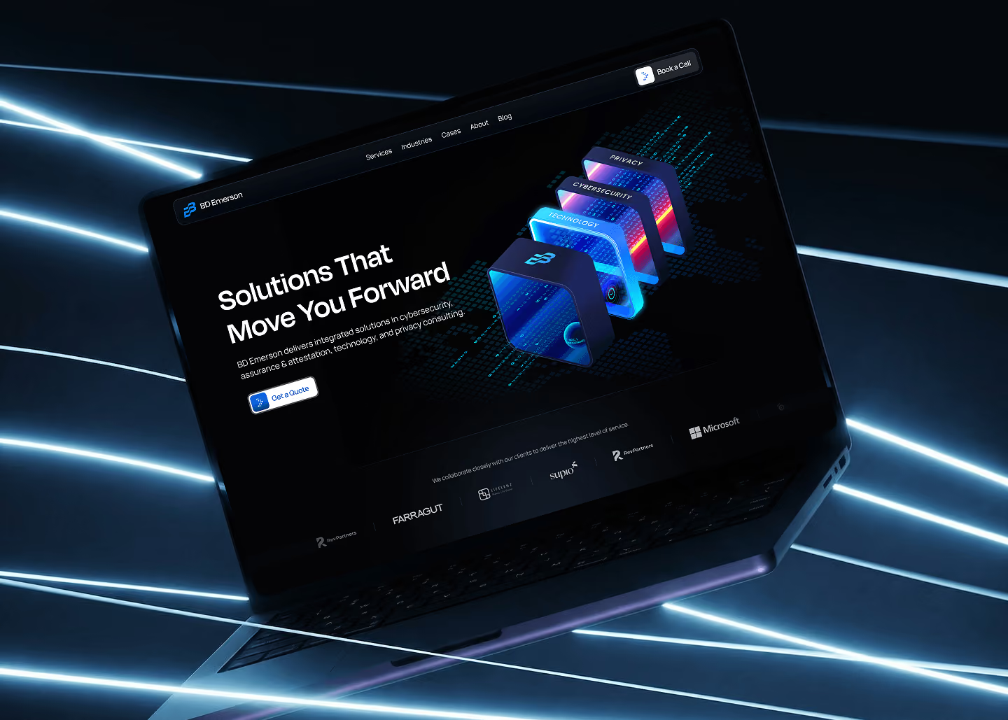
BD Emerson
Ravetree
JonnyDo
Aware Technologies
SDI Presence
Element451
Seven Hills Technology
Nectar Edge
Datastory
LulleVibes
Setproduct
Penti
Social Motion
Flowlabs
CIM
Astro Information Security
CyberCrest
Momentum Studios
BD Emerson
Ravetree
JonnyDo
Aware Technologies
Responsive design for Webflow

Responsive design for Webflow

Responsive design for Webflow

WHO WE ARE

Foursets is a Webflow Premium Partner founded in 2021, with an in-house team of designers and Webflow developers. The people who draw your mobile layouts in Figma are on the same team as the people who build them in Webflow.

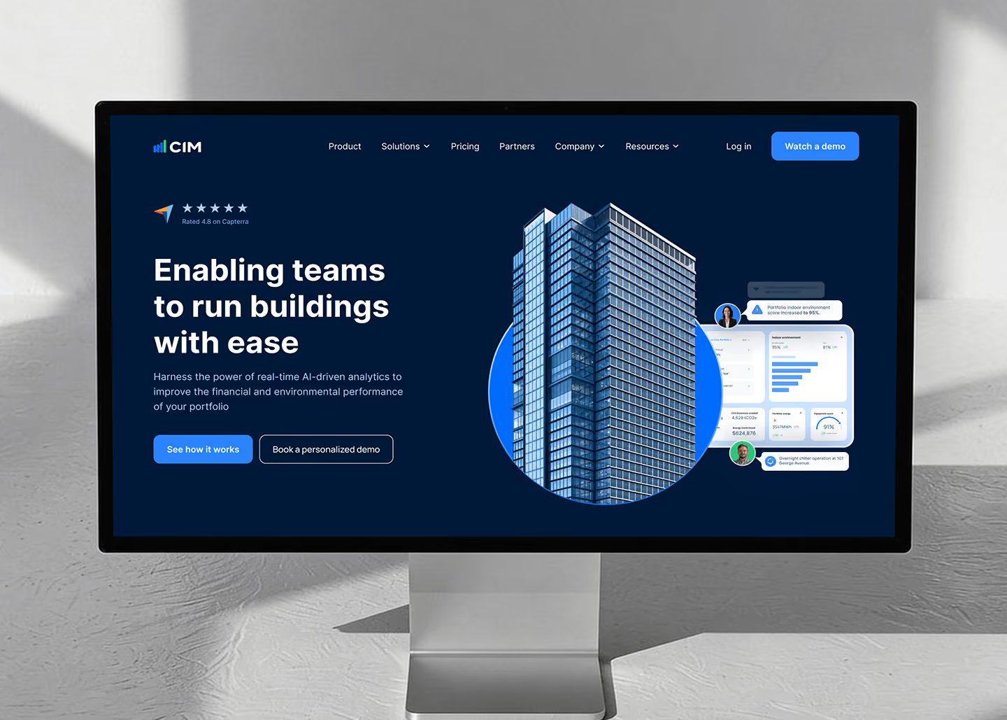
For CIM, we did a code cleanup and a rebuild of their Webflow site. After the cleanup, mobile PageSpeed went from 35 to 80 and desktop from 68 to 95. Conversion from visitors in CIM's ideal customer profile doubled after the rebuild.

PROBLEMS > SOLUTION

Common Problems, Uncommon Responsive Design Solutions

Challenge

An AI tool built your site fast. As it grows, keeping its mobile and desktop versions working turns into one more job for your team.

Your design files show only the desktop version, so the developer guessed the mobile layout during the build.

Navigation, tables, cards, and long headings that look fine on a monitor fall apart on smaller screens, and elements set in fixed pixels run off the edge.

Page speed on phones is low, and visitors from paid campaigns leave before the page loads.

Each new landing page breaks the layout again, and small fixes wait in the engineering backlog.

Our Solution

We design a responsive component system in Figma and build it in Webflow. Your team builds new pages from those sections, and they keep their mobile layouts.

Our designers draw the mobile layouts in Figma at the same stage as the desktop ones. You approve both before development starts.

Our responsive checklist covers navigation, the hero, grids, cards, media, tables, CTAs, modals, sticky elements, and long headings. We run it on each page before launch.

Before launch, the project manager who owns QA on your account checks mobile PageSpeed Insights scores against the targets in our QA standard.

We build reusable responsive sections for your new pages. The same team ships new pages and layout fixes on a retainer or an hourly package.

WEBFLOW EXPERT & PARTNER

Webflow experts, Premium Partners, and template authors, all in one shop

Foursets has been a certified Webflow expert since 2019. We are also an official Webflow template author and a Webflow partner at the Premium tier, the highest level in Webflow's partner program outside of Enterprise. On a mission to become a Webflow Enterprise Partner.

Reviewed by Webflow

Webflow independently reviewed our work and certified that it meets Webflow's standards.

Priority support

Our partner tier gives us a direct line to Webflow's partner team when a layout bug sits in the platform itself.

Platform depth

We build your layouts on Webflow's native breakpoints as reusable components.

Our Services

Responsive Webflow Design From Figma Breakpoints to Live Pages

One in-house team takes your site from Figma to Webflow.

(1/6)

Mobile layouts designed in Figma

Our designers draw your mobile layouts in Figma next to the desktop design, with their variants and states. A desktop section that would be unreadable on a phone gets a custom design for small screens. Our developers test the built pages at tablet sizes.

(2/6)

Responsive Webflow build

Text, images, and cards adapt between breakpoints because we size them in relative units on flexible grids. Font sizes and spacing follow the designs you approved.

(3/6)

Responsive component library

We turn your sections into reusable Webflow components with their mobile layouts built in. Your marketing team assembles new landing pages from them, and each page starts out responsive.

(4/6)

Mobile speed

Images go into Webflow as compressed PNG files, and we convert them to AVIF with Webflow's own image compression. AVIF is a modern format that usually weighs less than WebP or JPEG. Link-preview images for social networks stay PNG or JPG, since those networks don't read AVIF. Deeper speed work, such as cleaning up scripts and leftover code, is part of our page speed optimization service.

Speed up my site

(5/6)

Cross-device and cross-browser QA

We test layouts and interactions on the most common phone, tablet, and desktop resolutions, in the latest two versions of Chrome, Safari, Edge, and Firefox. Our layouts are fluid, sized in relative units on flexible grids, so they hold up between the sizes we check. When a design is fixed to exact pixels or a page has an unusual layout, we add more screen sizes to the test. On rare or older setups we accept small visual differences as long as everything still works.

(6/6)

New pages on the same responsive system

After launch, we build the new pages and sections you need from your component library, and each one goes through the same screen tests before it goes live.

Case Studies

The results speak for themselves

In these six B2B Webflow projects, our team designed or built the mobile layouts. Each case page shows the full project and its results.

Pricing

Deep expertise with simple, transparent pricing

One-time engagement

Fixed scope, fixed price

A full website redesign, migration, or SEO audit with everything defined upfront

The invoice matches the proposal

Starting from

$60/hour

Start my design project

Hourly packages

Prepaid hours valid for a month, quarter, or year

Use them when you need them

Starting from

$900/month

Browse design packages

Monthly retainers

A dedicated Webflow development team embedded in your Slack

Month-to-month, no lock-in contracts

Starting from

$3,000/month

See design retainers

webflow integrations

Your existing stack stays intact

Webflow doesn't replace your tools. It connects to them. We wire every new site to the platforms your team already runs, so your data flows cleanly from day one and nothing breaks at launch.

Advantages

Why Choose Foursets for Responsive Webflow Design

We replaced the standard agency "trust me, bro" model with radical transparency and zero hidden risks.

Three QA passes before a page is done

On projects and retainers, each page goes through three QA passes. The developer checks the build. A designer compares the built page with the approved Figma file. Then the project manager opens the page on desktop and mobile in each supported browser.

Test screens picked from usage data

Our test resolutions are the five most common per device type in StatCounter data, from a 360×800 phone to a 2560×1440 monitor.

Mobile speed targets in our QA standard

Our QA standard sets PageSpeed Insights targets of 90 or more on desktop and 75 or more on mobile. Before launch we measure your homepage and two key templates against them.

Zero outsourced freelancers

Our Webflow designers and Webflow developers are all full-time Foursets employees. Your Figma files and your build stay inside one company from the first layout to launch.

One pod from design to new pages

Your site stays with one pod of 5 to 8 senior people. The pod that builds your breakpoints also builds the landing pages you add after launch.

Staging links on your own phone

You get a shared Slack channel and a ClickUp board from kickoff. We post staging links in Slack, and you can open each mobile layout on your phone before it goes live.

A Site That Works on Your Buyer's Phone

Nick Rybak

Nick Rybak

Founder & CEO

Share your URL for a free website audit, and we'll show you what breaks on your current pages.

Get a free website audit
Nick Rybak

Nick Rybak

Founder & CEO

INDUSTRIES

B2B companies we know inside out

We've built and grown websites for B2B teams at every stage and across every vertical. Real projects, real clients, real outcomes.
By industry:
Conferences
Event websites with speaker listings, agenda systems, and third-party registration tools, built to launch before the deadline.
Construction
Tech companies selling software, platforms, and services to the construction industry.
Cybersecurity
From compliance platforms to pentest-as-a-service, cybersecurity clients need credibility fast. Work that signals expertise before the demo.
E-Commerce
B2B ecommerce platforms and industrial suppliers that need enterprise-grade portals on flexible platforms.
Fintech
Regulated industries where trust signals win deals before demos happen.
Healthcare
HIPAA-aware builds for health tech companies that need to convert enterprise buyers.
Tech Companies
Technical teams that need a website matching the sophistication of their product.

AWARDS

We don't have a trophy shelf (remote company). But if we did, it'd look like this

Clutch Top Web Agency
in Poland
HubSpot Solutions
Provider
Semrush Certified
Expert
CSS Design Awards Honorable Mention x2
Webflow Premium
Partner
Awwwards Honorable Mention x2

Pages That Work as Designed on Every Screen, New Ones Included

Share your site or your Figma file. We'll review how the layout holds up on a phone and come back with a quote.

Get my mobile layout review

Testimonials

The nice things partners say about us

Burned CMOs and founders usually come to us highly skeptical and traumatized by past agencies or freelancers. Here's what happens after they experience actual predictability.

50+

Enterprise clients signed from the website

"They have truly transformed our marketing landscape."

Drew Danner

Managing Director, BD EMERSON

Explore case study

+300%

Organic search traffic increase after redesign.

“Working with Foursets was a transformative experience for Setproduct."

Roman Kamushken

Founder, Setproduct

Explore case study

2x

ICP conversion increased.

"We are very happy with their service."

Kateryna Dmytriyeva

Growth Manager, CIM

Explore case study

35%

Lead-to-client conversion rate from website.

"They had a strong knowledge of all aspects and provided a great thought partner to execute the goals."

Jeff Reed

Founder & CEO, Momentum Studios

Explore case study

50%

Increase in qualified leads post-launch.

“Their white-glove service is impressive.”

Orit Benzaquen

CEO, Penti

Explore case study
4.9 stars, 30 reviews
Webflow Premium
Partner & Expert

The Stats

Proof over promises

96.8%

On-time delivery rate since 2021.

Zero

Outsourced freelancers. Every Foursets team member is a full-time employee.


5 to 8

People in each pod, and each pod keeps its own accounts.

100+

Clients served.

3 days

Average time to launch a whole new landing page for retainer clients.

48 hours

Average time from a task dropped in Slack or ClickUp to a live URL, for retainer clients, across all request types.

FAQ

Frequently Asked (and Honestly Answered) Questions

What is responsive web design?

Responsive web design is an approach where one set of pages adapts its layout to the screen it opens on, from a wide monitor to a phone. Columns stack, images resize, and menus fold into a smaller form. The content and the URL stay the same. On a responsive B2B site, the buyer on a phone reads the same offer as a colleague at a desk.

Is responsive web design still a thing?
Why is responsive web design good for SEO?
What is mobile-first responsive design?
How do you test a responsive website?
What CMS supports fully responsive site design?
How much does it cost to pay someone to design your website?
Where can I find Webflow experts in responsive design?

resources hub

The latest from our team

Recent guides, breakdowns, and podcast episodes from Foursets on designing, building, and growing B2B websites in Webflow.